We have redesigned the Add Account Class interface to streamline data entry and improve page navigation. These updates focus on visual clarity and reducing time spent. The key enhancements are:
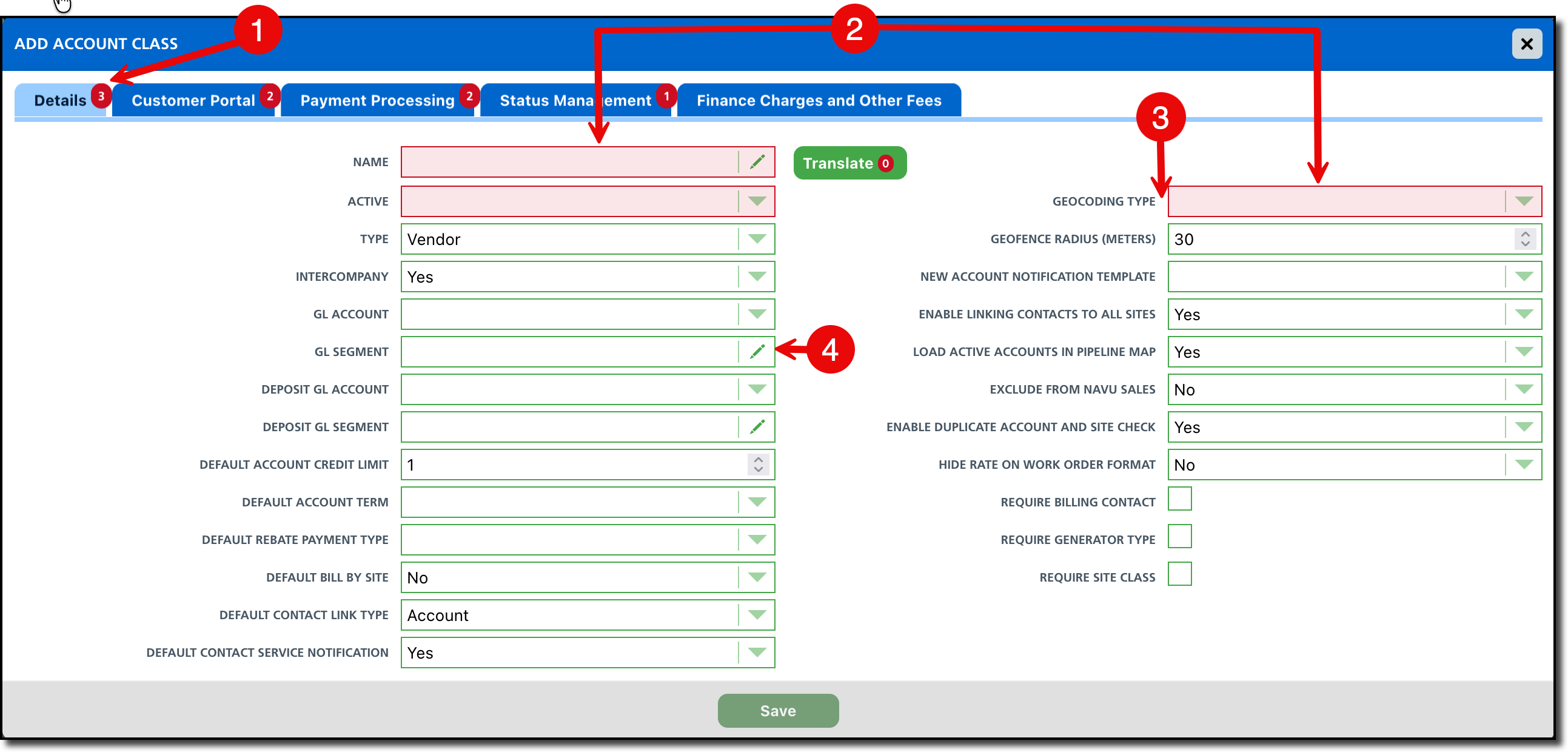
Real-Time Validation Indicators: Each of the five tabs now feature a red tick mark. This indicator remains visible until all required fields within that specific tab are completed.
Optimized Two-Column Layout: Fields are now organized into a two-column grid rather than a single vertical list. This consolidated view significantly reduces page length and provides a more concise overview of account class details.
Improved Label Alignment: To create a clearer visual connection between descriptions and data entry, all field labels are now right-aligned.
Editable Field Indicator: New visual cues have been added to text and numeric fields to instantly indicate whether a field is editable vs a dropdown, preventing confusion during the update process.
Pathway: Setup > Account Class > [Select green + to create new]
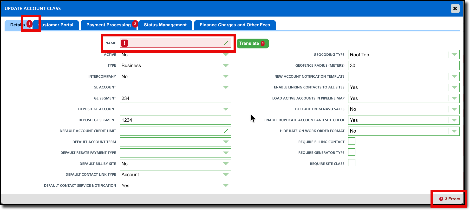
We’ve also added a smart counter to the Update Account Class page. Located in the bottom-right corner, this counter tracks missing data, providing a clear count of required fields that need your attention before you can finalize your updates.
- This counter works in tandem with the red tick marks on each tab, guiding you directly to the sections that require completion.
- Each field missing data is also highlighted in red with an red exclamation icon.
Pathway: Setup > Account Class > [Double click an account class to edit]